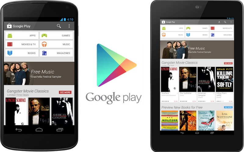
Android fans should be able to say “hello” to the newly-launched refresh of Google’s Play Store on Android phones and tablets. With larger images and themed groupings in the mix, it should be a lot easier for Android users to find exactly what they’re looking for, whether it be app, music, or something else.
Recommendations have also been revamped a little, but they continue to display the content that Google’s store believes is right up your alley. Purchasing has also been simplified to help you move right through checkout and get right down to enjoying your purchased download.
In order to receive this new Holo-inspired layout, your phone or tablet must be running at least Android 2.2 Froyo or above. If you haven’t received the new layout update yet, don’t worry. Google will be staggering the rollout over the next few weeks, but rest assured you’ll have the new store UI coming to your device soon.
What do you think of the new look?

