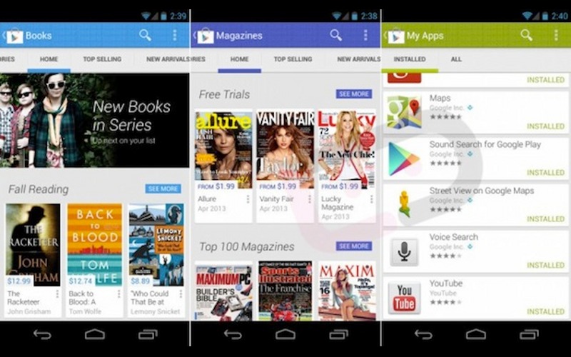
You have to love a fresh coat of paint, and that’s exactly what the next version of Android‘s Google Play Store is receiving with Google Play 4.0.
The good people at Droid-Life were able to obtain an APK for the new version of Google Play and were kind enough to post a video of the preview. The new version predictably features a new Holo-style look for the Play Store similar to what we see on the current version of WhatsApp. Many pages are blank, unfortunately, but it’s to be expected due to the fact that it is, after all, an unreleased preview version. There are some similarities with the layout of the current iteration of the Google Play store here as well, bringing a nice blend of the old with the new.
There’s no date as to when this new version will see the light of day, and with Google I/O lurking on the horizon, it’s possible we won’t be able to get our hands on the new Google Play 4.0 until then. Until then, all we can do is look at it from afar on video. What do you think of the new Holo look?

