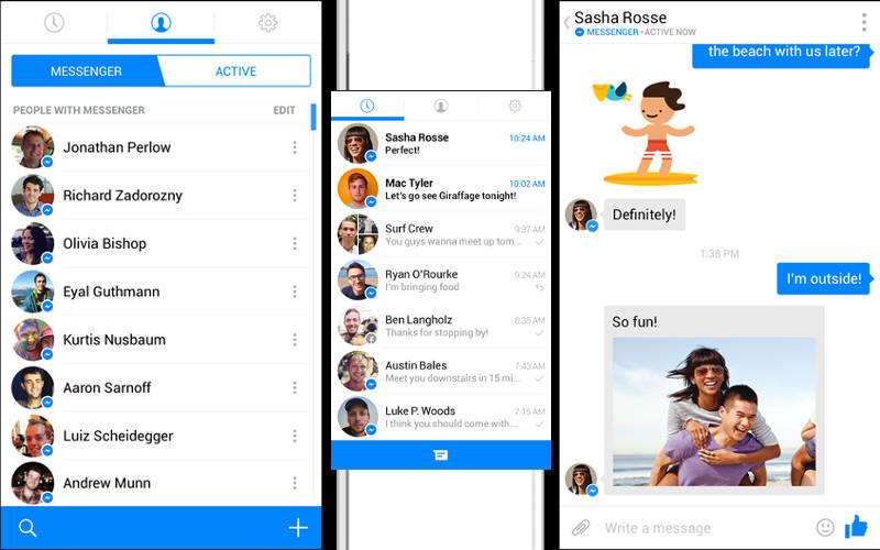
Facebook Messenger (now just “Messenger”) is certainly looking to maintain its own against growing and stiff competition in the messaging market. That’s why its latest version looks, well, like many others already on the market.
We’re looking at a complete UI change in the new Messenger with new icons, text, and buttons shades of blue to boot. Badges show which friends are using the Messenger application, which can be seen on newly designed profile photo areas. Of course, the stickers make a triumphant return, which almost makes the app look like a blue version of LINE or Viber.
Messenger designer Luke Woods said the app was a “refresh” for the Messenger brand that will make the app appear more native on both iOS and Android rather than just a port from one platform to another.
A random group of users will be able to test the newly-redesigned app starting now, with a broader rollout to both iOS and Android happening “in the coming weeks.”

