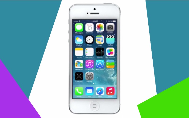
Today has certainly been a busy day for tech. Between Xbox’s E3 announcements, and Apple’s WWDC, there’s quite a bit of information to sift through. The biggest news today, however, took a bit of mulling over to really sink in: the new redesign of iOS 7.
At its core, iOS 7 is still iOS. It still features the familiar icons, the apps, and the noticeably Apple-esk design in many parts of the OS, including the rounded edges on its icons or buttons. The skeuomorphism has taken a back seat in favor of simplicity.
What it arguably does with its new flat design and colors is take a page straight out of the book of Windows Phone, right down to even the new default search engine switching from Google to Bing.
That doesn’t mean the design was stolen at all. Inspiration can come from anywhere and it’s a well known fact that simplicity is often the best way to go with design. Microsoft knew this, and Apple clearly saw this as well.
Of course, we can likely expect Apple to deny such a resemblance exists and say the design was thought of just out of the blue. One thing is for sure though: iOS 7 is going to look and feel a lot different when it hits our iPhones and iPads this fall.

