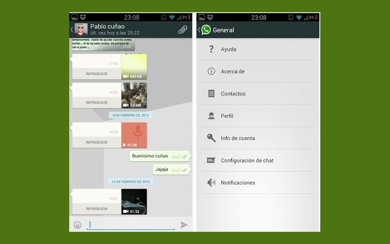
WhatsApp Messenger instant messaging application is rolling out a newer, more modern, and more elegant UI on Android, with the most recent beta taking a cue from the OS’s Holo theme and expandable notifications.
The new version removes the long-used and well-known speech bubble text boxes. Instead, the new Holo UI provides cleaner and larger boxes with which to read and enter text. Image previews are scaled larger in size as well. The main image window is also revamped to take on a much less intrusive role. For multimedia files, the exceedingly large “Play” and “View” buttons have been removed in favor of a much smaller button at the bottom of the preview.
The much loved emoticon placement has also changed and emoticons are now at the bottom left, right next to the text-box instead of on the top right corner. The theme colors of the older application have given way to lighter and brighter colors. Finally, the background wallpaper in a chat window can be changed directly from the chat instead of having to visit settings every single time.
The new WhatsApp UI is still in the Beta stage, so it has not rolled out to the Google Play store yet. We imagine it won’t be too long before we’re able to “officially” enjoy the new look. Of course, if you can’t wait, you can always download the beta from the WhatsApp website.

