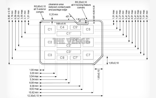
It’s an almost comical battle of epic proportions over a microscopic piece of plastic, but the warring sides appear to be working together to find a compromise if the newly-unveiled nano-SIM redesign is any indication.
On one side there’s Apple, notorious for wanting things “its own way” and willing to go the extra mile or spend the extra dollar (or billion) to get it. On the other is a coalition formed by RIM, Motorola and Nokia.
Each group is poised to make their own nano-SIM design the ETSI standard. Neither entity has seemed willing to extend an olive branch and come up with any compromise, at least until recently. RIM and Motorola have updated their design proposal in an effort to reach middle ground with Apple, and it appears that they were more than accommodating in the chip’s refreshed look (in the image from The Verge seen above).
You would think the designs for the nano-SIMs would be so similar that a compromise would seem easy and natural, right? Wrong.
RIM and Motorola have insisted from the beginning that a “notch” is necessary to allow for “push-push” mechanisms (push to lock the chip in place, push to pop it back out again); Apple, on the other hand, has been entirely anti-notch — not a surprise, given the fact that the company uses SIM trays on the iPhone, therefore making the concept of a notch completely irrelevant.
In its redesign, however, RIM and Motorola took elements from both sides of the fight and combined them. The new look retains Apple’s simple rectangular style, but still makes room for a low-key notch on one side.
The next ETSI meeting on May 31st and its difficult to say if this change will be enough to appease Apple, but hey, at least they’re trying. Head to the source if you want to see the difference between the original designs and the latest version. You will probably be using these with your international SIM service in the near to far future.

